Case Study: WordPress Device-Agnostic Website Development
We’ve developed a WordPress website for Maria Reig Florenca based on prepared UI and adapted & optimized it for multiple devices to promote accessibility and support for clients’ customers who used legacy devices.
Client & Challenge
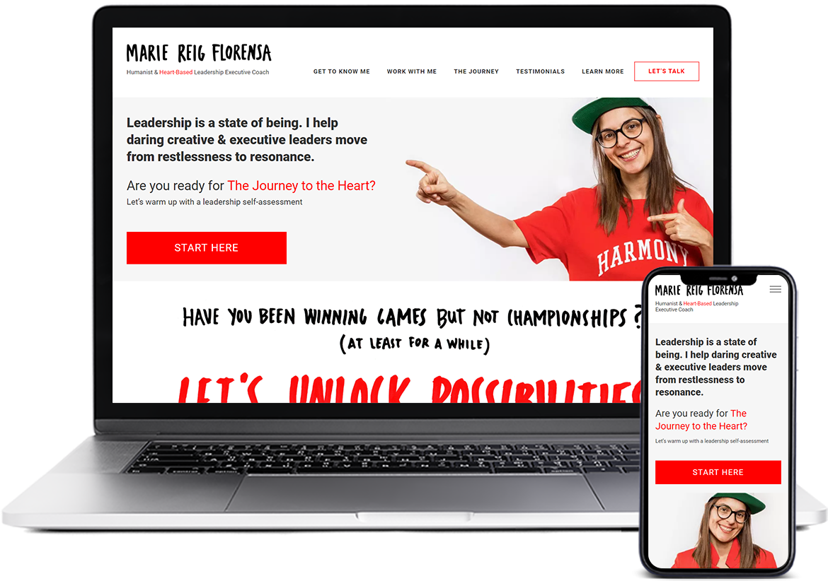
The website’s owner, Maria, a leadership executive coach, asked us to build a website. She already had a design she wanted to use and all its beautiful hand-drawn visual components.

Building a WordPress website is something we’re very good at, so the development itself prompted no challenges. But Maria wanted her resources to be super-accessible and fine-looking on old devices — desktop and mobile. Most issues we’ve faced have been connected with adapting all this visual goodness to different resolutions and OS systems.
We also had to work on a tight deadline: the client had a coaching industry event she wanted to participate in, and that meant the website had to be ready by the date of it.
Solution
We extensively tested and optimized this WordPress website, going through more than 70 re-iterations with the client. We rejected the idea of using DevTools and emulators to check the website’s responsiveness, and used real devices. Maria also helped us cover testing on devices we didn’t have access to.
Hand-drawn maps, hand-written typography, and brushstroke-like frames around the pictures proved to be the most challenging aspects of the layout to adapt: but we’ve managed to do it, through tweaking, optimizing, testing, getting feedback, and doing it all again until everything looked good. That was the job of our project manager and a frontend developer who worked with CSS and HTML.
When we finished markup work, our backend developer transferred the project to chosen hosting, registered the domain, and covered various server-side aspects of the resource’s security.
In the end, we connected additional functionality the client wanted to implement (like SurveyHero she uses for preliminary customer surveys) and conducted the final assessment. We’ve also connected and set up the WordPress Admin Panel to be comfortable and simplistic.
Value
We did complete the project in time for Maria’s event.
Right now, her website looks good and is easy to use on iPhone 6+ (OS 12+), MacBooks from 2011+, iPads — and all devices that use Android. Accessibility provides a huge added value for all projects, but especially for people-to-people services that have to be as user-friendly, available, and easy to navigate as possible.
Our collaboration also has busted the notion of accessibility being an antonym to an aesthetic: the website is platform- and device-agnostic, but it still looks beautiful.